Orbital drift of the EIS wavelength scale#
There is a shift of the spectral line position during the 98.5 minute Hinode orbit that is due to the thermal changes occuring across the instrument during the orbit and was expected before launch.
The effect is clearly seen if a velocity map is made from an EIS raster, such as the example below.

Wide, alternating bands of red and blue shift are seen that have an amplitude of about 35 km/s and thus mostly dominate the real solar Doppler shifts.
The amplitude is approximately fixed in wavelength/pixel space to 0.0223 angstroms/1 pixel, and thus the velocity amplitude varies with wavelength. E.g, for Fe XII 195.12 it is 35 km/s, while for Fe XV 284.16 it is 24 km/s.
Two methods are available to users for correcting the orbital drift: one uses instrument housekeeping data, while the other uses the spectral data themselves. Both have drawbacks, and a general rule of thumb is that EIS absolute velocities are accurate to no better than 4 km/s.
Instrument housekeeping data correction#
This method is described in detail by Kamio et al. (2010) and basically makes use of temperature readings within the EIS instrument to model how the Fe XII 195.12 line drifts on the detector over the course of the mission. Unlike the correction method based on measured centroid positions (see below) there is no need to make an assumption about the large scale velocity structure in a single raster.
Software implementation of the housekeeping data correction method
Measured centroid correction#
We are currently collecting data that will allow us to model this accurately for correction. As well as orbital variation, there will be seasonal variation as well. In the meantime, especially when dealing with rasters, you must correct for this. An uncorrected velocity map looks like the attachment, where you can clearly see the change in red and blue shift during the orbit. Software is being produced to correct for this but is not within eis_prep. It is now released to SSW (eis_orbit_correction). You can correct for the variation by modelling the line position along the time direction and subtracting that component which is sinusiodal in shape.
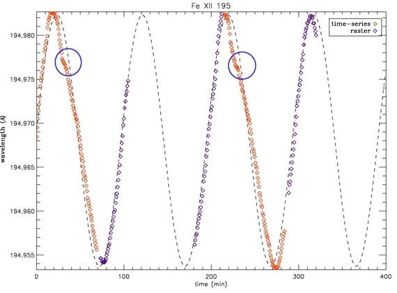
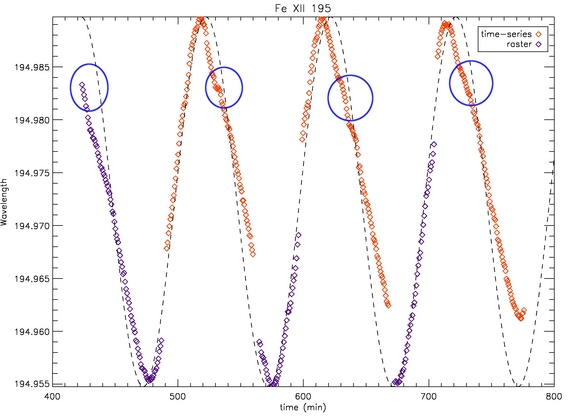
I've been working with the 2" slit. I took different data from different days (13/April 17-22h and 19/April 18-22h) and I've plot the mean value of the position of the Fe XII 195.12 line. As you can see in both days there is a kink (marked with a blue circle). I've been looking for the best way to solve it, and the dashed line that is in the plot is a sinusoidal fit that I've tried but that is not perfect. In my opinion that kink is produced by thermal effects, since it is repeated in the other day and. The best way I've found to fix that is using splines every 5 time-steps as it is used in EIS_ORBIT_CORRECTION.PRO for 1" slit. But in that program it uses as reference wavelength the mean value between the maximum and minimum of the file, whereas I used the min and max of the all dataset ( I think that's important because if you have different files they will be corrected with different reference wavelength).


-David Pérez-Suárez, 2007-Sep-21